Broadsides
Broadside for CBA: Spring 2017
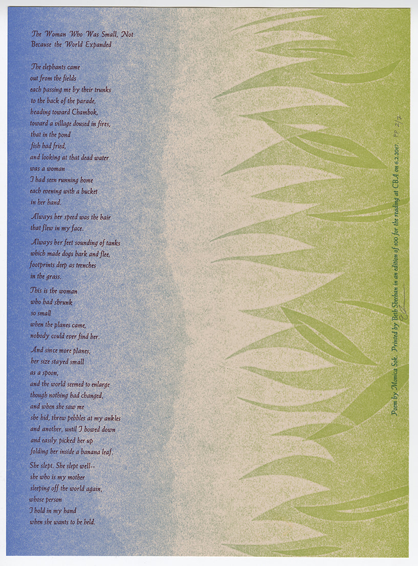
I produced this broadside for the Center for Book Arts' Broadside Reading Series for the Spring of 2017 in honor of the reading by Monica Sok. The broadside is pressure printing and letterpress printed handset type.
For this broadside, I pressure printed the first layer in a green to blue rainbow roll on the Vandercooks at the Newark Print Shop. I then printed the handset type in a deep purple at the Center for Book Arts. Due to the nature of the poem, I decided to print the text reading perpendicular to the landscape because I liked the idea of changing perspective. The viewer can see the greenery as obvious grass beneath a blue sky, but because they are forced to turn the broadside to read it, they may also start to see the greenery as leaves on tree limbs, stretching down to the water.
For this broadside, I pressure printed the first layer in a green to blue rainbow roll on the Vandercooks at the Newark Print Shop. I then printed the handset type in a deep purple at the Center for Book Arts. Due to the nature of the poem, I decided to print the text reading perpendicular to the landscape because I liked the idea of changing perspective. The viewer can see the greenery as obvious grass beneath a blue sky, but because they are forced to turn the broadside to read it, they may also start to see the greenery as leaves on tree limbs, stretching down to the water.
Broadside for CBA: Fall 2016
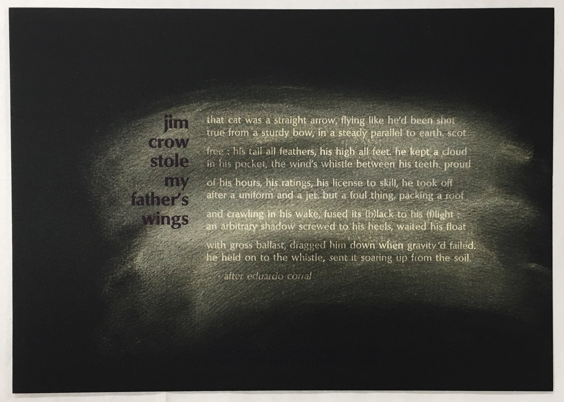
Wayne Kleppe and I produced this broadside for the Center for Book Arts' Broadside Reading Series for the Fall of 2016 in honor of the reading by Evie Shockley. The broadside is handset type letterpress printed and partially dusted with gold powdered pigment.
For this collaboration, Wayne Kleppe chose the poem, set the type, and chose the paper. Because of the nature of the poem as well as the darkness of the paper, I decided to print the body text of the poem first and then dust the fresh ink in powdered gold. After dusting the body of the poem, I printed the title and colophon in a purple-black ink.
For this collaboration, Wayne Kleppe chose the poem, set the type, and chose the paper. Because of the nature of the poem as well as the darkness of the paper, I decided to print the body text of the poem first and then dust the fresh ink in powdered gold. After dusting the body of the poem, I printed the title and colophon in a purple-black ink.
Hand Papermaking Magazine Donor Broadside: 2016
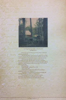
Kyle Holland and I were selected to represent the Morgan Conservatory by creating a broadside for Hand Papermaking Magazine's end-of-year campaign. All donations over $100 made to Hand Papermaking Magazine for their end-of-year campaign receive a copy of the broadside.
The piece has a pressure printed background of text written by Kyle Holland, letterpress printed text taken from a short story by Christopher Bowen, and an Impossible Project photograph taken by Beth Sheehan then inkjet printed and tipped onto each broadside.
Photo courtesy of Hand Papermaking Magazine.
Broadside for CBA: Spring 2016
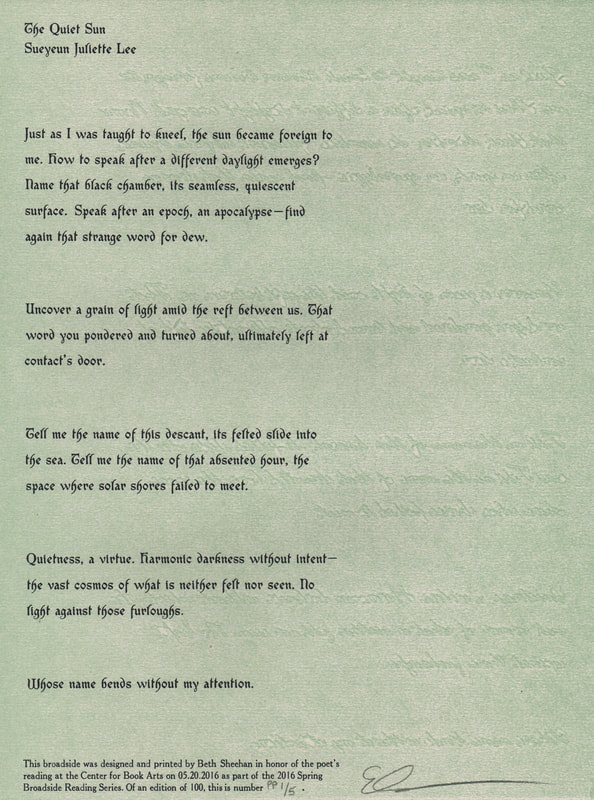
I produced this broadside for the Center for Book Arts' Broadside Reading Series for the Spring of 2016 in honor of the reading by Sueyeun Juliette Lee. The broadside is pressure printing and handset type.
The idea for this broadside was inspired by the apocalyptic feeling of the poem. I picture the reader wandering alone in an empty forest after a great disaster. The Fabritius typeface, courtesy of Purgatory Pie Press and Kyle Holland, is reminiscent of the forest with some of the letterforms resembling tiny trees and twigs. The faint imagery in the background of the piece is the body text of the poem, written in cursive and mirrored to call to the idea of an echo. It was pressure printed in a gray-green which is often the color of the sky prior to natural disasters such as tornadoes but also a color that hints at a thick smog obscuring the forest.
The idea for this broadside was inspired by the apocalyptic feeling of the poem. I picture the reader wandering alone in an empty forest after a great disaster. The Fabritius typeface, courtesy of Purgatory Pie Press and Kyle Holland, is reminiscent of the forest with some of the letterforms resembling tiny trees and twigs. The faint imagery in the background of the piece is the body text of the poem, written in cursive and mirrored to call to the idea of an echo. It was pressure printed in a gray-green which is often the color of the sky prior to natural disasters such as tornadoes but also a color that hints at a thick smog obscuring the forest.
Broadside for CBA: Fall 2015
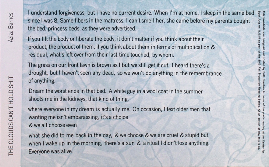
I produced this broadside for the Center for Book Arts' Broadside Reading Series for the Fall of 2015 in honor of the reading by Aziza Barnes. The broadside is pressure printing and handset type.
Reading this poem The Clouds Can't Hold Shit, I was captivated by the image of a bare mattress. For me, there's an intense nostalgia in those old mattresses—with weird floral designs printed on them just to be hidden beneath the sheets. There's a distinct mindset that accompanies laying on that beautiful naked mattress—not to sleep but to think. This poem felt so much like that mindset.
The design of the broadside came from the printed pattern of an installation by Anna Kell, photographed by Samer Fouad and made into a pressure printing plate and printed by myself at the Center for Book Arts.
Photo courtesy of the Center for Book Arts.
Broadside for CBA: Fall 2014
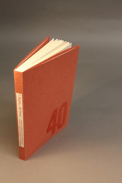
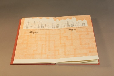
I produced this broadside for the Center for Book Arts' Broadside Reading Series for the Fall of 2014 in honor of the reading by Thomas Sayers Ellis & Rodrigo Toscano. This piece is their poem titled A Media Feels Your Axis. The broadside is pressure printed and handset type. The broadside was also part of the Center's 40th Anniversary Publication.
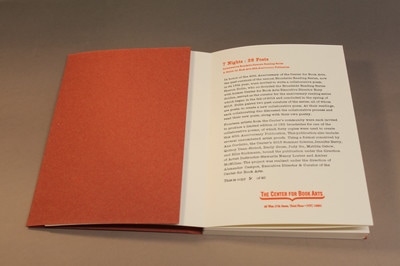
In honor of the 40th Anniversary of the Center for Book Arts, the past curators of the annual Broadside Reading Series, now in it's 15th year, were invited to write a collaborative poem. Sharon Dolin, who co-founded the Broadside Reading Series with former Center for Book Arts Executive Director Rory Golden, served as the curator for the anniversary reading series which began in the fall of 2014 and concluded in the spring of 2015. Dolin paired two past curators of the series, all of whom are poets, to create a new collaborative poem. At their readings each collaborating duo discussed the collaborative process and read their new poem along with their own poetry.
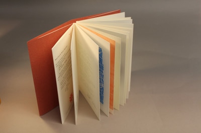
Fourteen artists from the Center's community were each invited to produce a limited edition of 150 broadsides for one of the collaborative poems, of which forty copies were used to create this 40th Anniversary Publication. This publication also include several unnumbered artist proofs. Using a format conceived by Ana Cordeiro, the Center's 2015 summer interns, Jennifer Berry, Quincy Dean-Slobod, Emily Gross, Judy Gu, Matilda Ostow, and Ellis Suchmann, bound the publication under the direction of Artist Instructor-Stewards Nancy Loeber and Amber McMillan. The project was realized under the direction of Alexander Campos, Executive Director & Curator of the Center for Book Arts.
Italicized text above was taken from the Center for Book Arts website. Photos courtesy of the Center for Book Arts.

